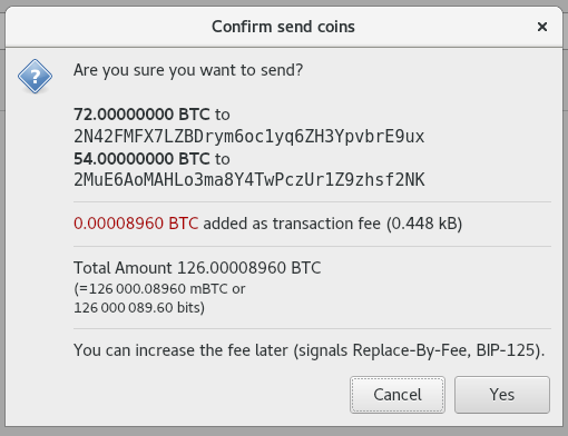
f08a385590 [qt]: changes sendcoinsdialog's box layout for improved readability. (marcoagner)
Pull request description:
I'm addressing two (probably duplicate) issues: https://github.com/bitcoin/bitcoin/issues/11606 and https://github.com/bitcoin/bitcoin/issues/10613.
Some points worth noting:
- I've tried to balance the proposed changes on both issues without going too far and remaining a bit conservative. It will be easier to improve based on suggestions where necessary.
- I preferred to maintain a layout that doesn't ask for an address truncation because, in my view, this wallet should be conservative on this.
- I didn't follow the idea of aligning the amounts to the right for finding it more natural (and minimalist) to read the information without having to map alignments. Additionally, that approach seems to need more `<hr />`'s (or similar) in order to help the user to map information, which ended up cluttering the box too much (specially with multiple recipients). Thus, I preferred to just give some more space between recipients. Let me know if there are better ideas on this.
Visually, I went from this (current):

To this:

As a side note, while doing this, I thought about a better way to show fees and found there's already a PR on this (https://github.com/bitcoin/bitcoin/pull/12189) and thought it is
Tree-SHA512: e94b740fab6c1babd853a97be65c3b6f86ec174c975a926fde66b147f7a47e0cf0fa10f7255ba92aaba68c76a80dde8c688008179a34705a9799bf24d3c5cd46